按钮
代码示例
xml
<Lay:LayButton Content="默认按钮" Type="Default" />xml
<Lay:LayButton Content="圆角按钮" CornerRadius="19" Type="Default" />xml
<Lay:LayButton Type="Default">
<StackPanel Orientation="Horizontal">
<TextBlock HorizontalAlignment="Center" VerticalAlignment="Center" FontFamily="{StaticResource IconFont}" Text="" FontSize="16" />
<TextBlock Text="图标按钮" VerticalAlignment="Center" Margin="5,0,0,0" />
</StackPanel>
</Lay:LayButton>xml
<Lay:LayButton Content="加载中按钮" Type="Default" IsLoading="True" LoadingContent="加载中..." />图片示例
基础用法
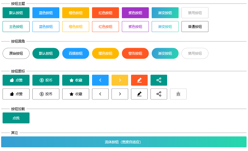
你可以使用 Type 属性来定义按钮的类型。
使用 Type 属性来定义按钮的类型。 该属性可选值为 Primary、Default、Normal、Warm、Danger、Customize。
加载状态按钮
点击按钮来加载数据,并向用户反馈加载状态。
通过设置 IsLoading 属性为 true 来显示加载中状态。
TIP
您可以使用 LoadingContent 属性自定义加载时显示的内容。
链接按钮
你可以使用 Uri 属性来定义按钮的超链接。
LayButton 属性
| 属性名 | 说明 | 类型 | 默认值 |
|---|---|---|---|
| CornerRadius | 按钮圆角 | struct | 0 |
| LoadingContent | 按钮加载时显示内容 | object | |
| IsLoading | 是否为加载中状态 | boolean | false |
| Type | 按钮类型 | enum | |
| HoverBackground | 鼠标悬浮时,按钮背景色 | Brush | |
| HoverBorderBrush | 鼠标悬浮时,边框颜色 | Brush | |
| Uri | 按钮跳转链接 | Uri |